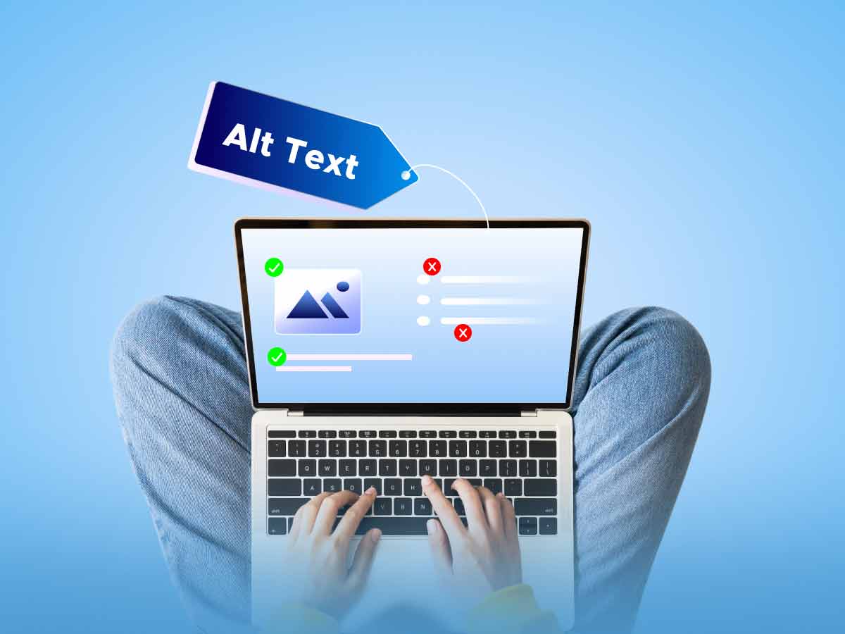
Good Alt Text, Bad Alt Text — Making Your Content Perceivable

What is alt text and who does it benefit?
Ensuring that all the content on your website is perceivable is one of the basic tenets of digital accessibility. Alternative text (or “alt text”) is text that is added to images and other non-text web content so that it can be perceived and understood by people who may not be able to see or otherwise grasp the meaning of it. For example, people who are blind or have low vision and who use screen readers or refreshable braille displays can’t see what a picture on your website is depicting. The assistive technologies they use need alt text for images, graphs, controls, and form fields so they can describe their meaning by voice. Alt text also benefits people with intellectual and learning disabilities who may have difficulty understanding an image or graph.
Here’s an example of alt text added to a picture about a devastating tornado outbreak in Kentucky. “A distraught man hugs his daughter in front of collapsed walls and scattered debris from their house destroyed by a tornado.” The facts and context of this alt text come from the news story. We’ll have more to say below about the alt text in this image.
Missing or flawed alt text are among the most common, and easy-to-fix, WCAG accessibility issues. When clear and concise alt-text image descriptions are provided, screen readers can read the description when the user hovers over the image. They will then be able to understand the full meaning of the non-text content. And remember, while web accessibility is a necessity for some of us, it enhances usability for all of us.
Alt text and WCAG: Success criterion 1.1.1
It’s not an accident that this WCAG success criterion appears first on the list. WCAG success criterion 1.1.1 is central to making your web content perceivable. The purpose of 1.1.1, as described by the Web Accessibility Initiative (WAI), “…is to make information conveyed by non-text content accessible through the use of a text alternative.” Websites can be rich with images, and many may have missing or inaccurate alt text connected to them. If alt text is lacking, people who use assistive technology to “see” and understand a picture won’t be able to. This creates a major access barrier for many users.
Alt text is particularly important when images or buttons are essential to transacting on a website or mobile application, such as instructions on how to use or purchase details of an item. It can take a sharp eye to find where an image needs alt text to be useful. For example, in a recent lawsuit, a shopping cart icon lost its “View Cart” text in responsive views and didn’t have alt text. This made the button unusable for mobile screen reader users. Alt text can be presented within the alt attribute of the image itself or the context or surroundings of the image.
Text alternatives are a key way to make information accessible because they can be received by sight, hearing, or touch. People who are deaf-blind also benefit as they can read the text in braille. Success Criterion 1.1.1 also helps people who have difficulty perceiving or understanding the meaning of visual content. For people with intellectual disabilities who may have trouble understanding the meaning of a graph or chart, text alternatives help make their meaning clear. Another benefit of text alternatives is that they enable people to search for non-text content.
When should I use/not use alt text?
Every image on your website should have alt text, unless it is purely decorative or includes no information to convey. In this case, the alt text can be left empty, marked as decorative, or coded as “null,” depending on the tool or platform you’re using to publish your content. This lets the screen reader bypass images that don’t convey any information. If your image is an icon or button that links to something, the alt text should describe what it links to, not just what the image or icon depicts. For example, you’ll often find icons such as envelopes or phones with no text on web pages that link to a “contact us” page. It would serve no purpose to add alt text for these icons that only describe “an envelope” or “a phone.” Alt text for these types of icons needs to make their function clear, for example, explaining that an envelope icon means “Send an email” or “Email us.”
Whether on your webpages or in documents and other content housed on your website, remember that alt text isn’t just for pictures. It also conveys meaning for clip art, charts, shapes, tables, graphs, videos, and other non-text content that have information that needs to be described. The effective use of alt text can also make your social media presence accessible to as many people as possible.

Writing good alt text — Context is key
If ten people write alt text for the same picture, you’ll probably end up with ten different versions of the alt text. Of course, that doesn’t make any of them right or wrong, but there are best practices in writing alt text, and paying attention to context is key. With good alt text, conveying the purpose of an image is as important, or more important, than describing what’s in it. Consider the picture above of the father and daughter standing in front of their home that was demolished by a tornado. This is the auto-generated alt text for the picture: “A picture containing outdoor, person, working, raft.” Auto-generated alt text uses object recognition technology to derive a description of an image. The results are often far from perfect, and this is an example of flawed alt text that doesn’t convey the point of the image. Some other possible alt texts for this picture might be:
- “Two people hugging in front of a construction site”
- “A man and a woman embracing near a demolished building”
- “A couple with a collapsed house in the background”
None of these examples of alt text convey the real meaning of that picture. Knowing the “story” or context behind an image is necessary for writing good alt text. This is why good alt text for the picture above would be “A distraught man hugs his daughter in front of collapsed walls and scattered debris from their house destroyed by a tornado.”
Because most alt text is subjective, it takes practice to create effective descriptions, especially when a link to additional content is embedded under the image. Everyone contributing graphics, photographs or other images to the design must understand how and why they need to provide brief, clear descriptions of the images they put on a website. Having a clear grasp of the importance and purpose of alt text before software design and user testing ensures that all content on the page, including images, is accessible to individuals with disabilities.
A few tips on writing effective alt text
- Don’t write “image of” or “pic of.” The fact that the non-text content may be a picture provides no meaning. The real question is what’s it about or what’s the message of the image.
- Keep it concise. If your alt text goes much past 125 characters, you’re probably using more words than are really necessary to create an effective description.
- If an image or other non-text content links to something, use alt text that describes where it goes and what it does, for example, “Contact us.”
- Spell correctly or your alt text will be mispronounced by a screen reader.
- If it’s a purely decorative image (for example, a swirling horizontal line or a picture of a pretty sunset), use empty or null alt text.
(Note: Keeping alt text short for complex non-text content like tables, maps, diagrams or charts is nearly impossible. In these situations, you really need two alt texts—one to indicate what the image is about and alt text for the chart or graph that directs the reader to a more detailed description on the website. For more information check out WAI’s tutorial on complex images.)
A word about CAPTCHAs
Do you know what the CAPTCHA acronym stands for? “Completely Automated Public Turing test to tell Computers and Humans Apart.” CAPTCHAs help maintain the security of web transactions by ensuring that a visitor is an actual human being and not a bot attempting to access a website. WCAG recognizes CAPTCHAs as a form of non-text content, like pictures, and require that “…text alternatives that identify and describe the purpose of the non-text content are provided, and alternative forms of CAPTCHA using output modes for different types of sensory perception are provided to accommodate different disabilities.”
People with a broad range of disabilities, from motor to intellectual to visual, find CAPTCHAs to be barriers to accessing web content and transacting business. Image-only CAPTCHAs, for example, may require the user to click on all photos that have a dog in them. Even if users have the option to use an audio or text CAPTCHA, there will be people with types of disabilities other than visual who will find it impossible to access or transact on a website. For these reasons, workarounds to CAPTCHAs are often recommended, like being able to contact a customer service representative to confirm who you are or setting up an email activation link process. For more on this subject read W3C: Inaccessibility of CAPTCHA.
Alt text resources
- An Alt Decision Tree (Web Accessibility Tutorials from W3C’s Web Accessibility Initiative)
- Charts & Accessibility (Accessibility & Usability from Penn State)
- Images with Text
- Alt Text with Various Contexts (Harvard University – Digital Accessibility)
- W3C’s Images Concepts Tutorial (Web Accessibility Tutorials from W3C’s Web Accessibility Initiative)
Related Posts
WCAG 2.2: New Success Criteria, More Inclusive Content
While the draft isn’t final, implementing the newly drafted 2.2 AA success criteria can’t hurt you, but it does have tremendous upside. First, 2.2 conformance...
Text over images: The impact on accessibility
Trends exist in every work environment. When it comes to design, the latest trends are often used by designers when creating content or updating a...
Five Most Common Accessibility Errors in Software Design and Development
Digital products start as a great idea, and make their way through analysis, design, implementation, and testing. But all too often accessibility considerations are overlooked. What...
